Table of contents
Open Table of contents
Intro
In my previous article, I talked about how I started working on Studynote, my educational app for A/L students. The first step? Designing the UI.
Now that I’ve been through multiple iterations, I thought it’d be cool to share the design journey—how the app evolved from Version 1 to Version 4.
Version 1: The First Concept
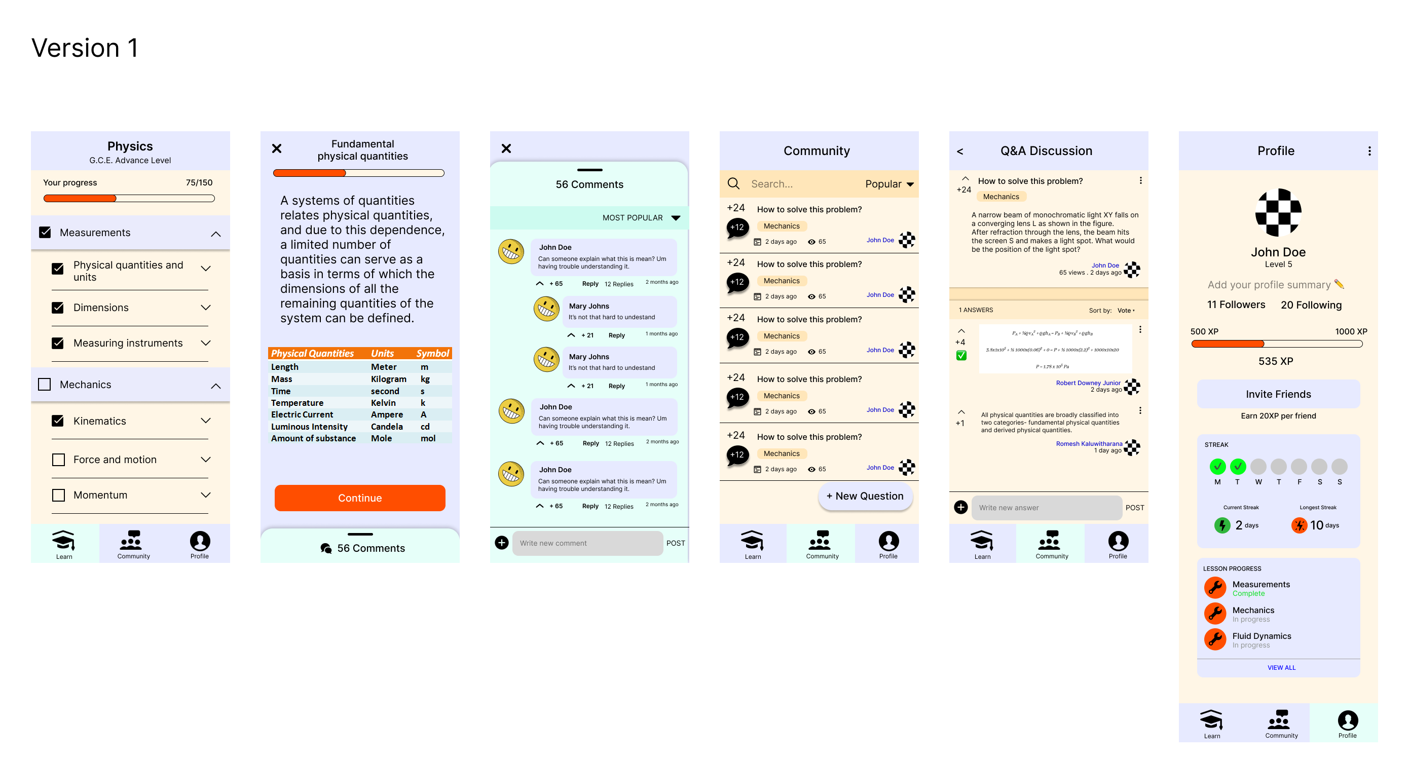
This was the very first design. Looking back, it’s clear that it lacked polish and structure. The colors were inconsistent, the UI felt crowded, and the overall experience wasn’t smooth. But hey, it was a starting point.
This was the very first design. Looking back, it’s clear that it lacked polish and structure. The colors were inconsistent, the UI felt crowded, and the overall experience wasn’t smooth. But hey, it was a starting point.
Key Takeaways from Version 1
- Too many elements cluttering the screen.
- The color scheme wasn’t engaging enough.
- Needed a better hierarchy for lesson structures.
Version 2: A Step Towards Simplicity
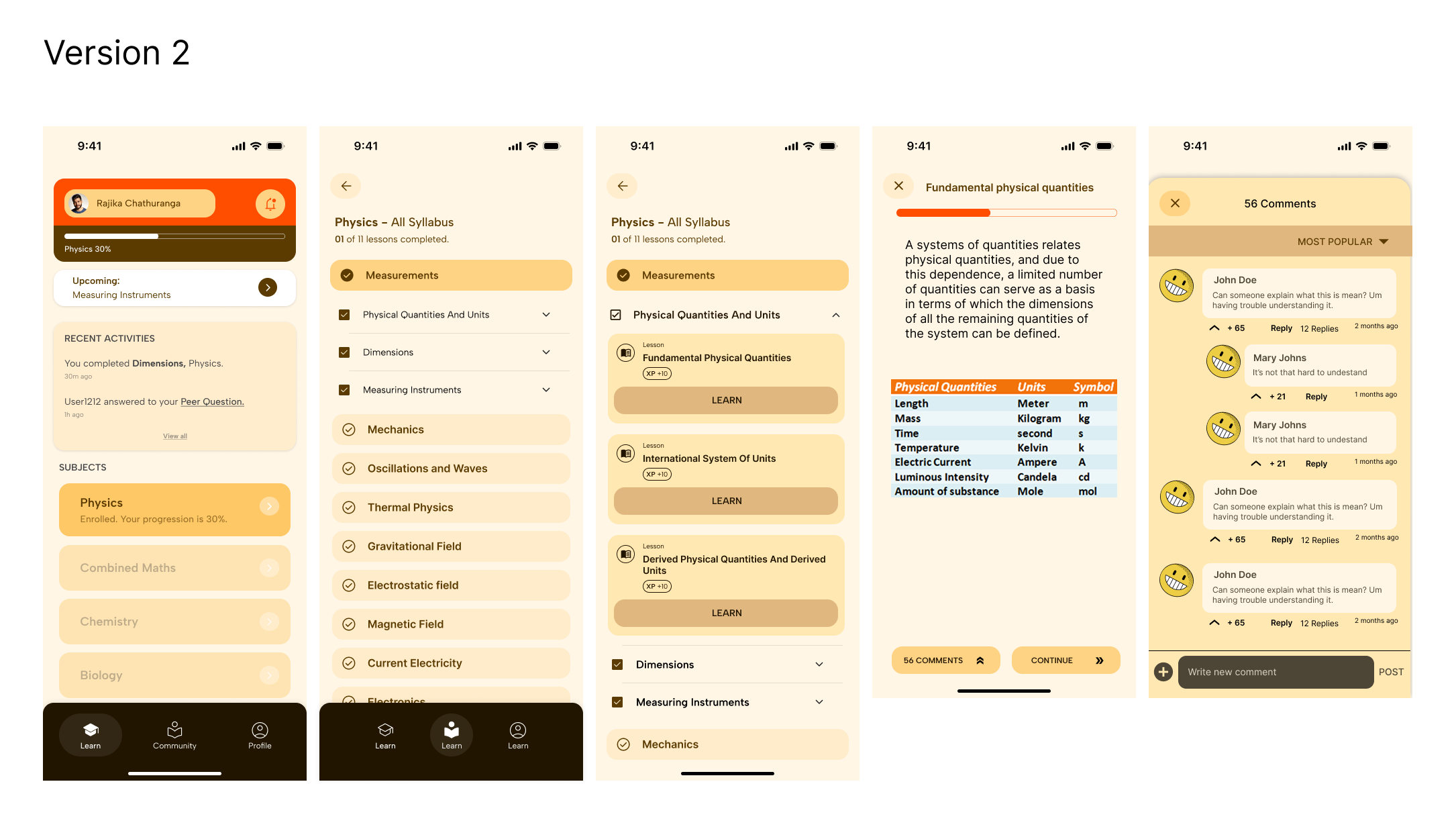
With Version 2, I moved towards a more structured and minimalistic approach. The color scheme became more cohesive, and the lesson hierarchy was clearer. I also introduced an XP system to make learning feel more rewarding.
Improvements from Version 1
- Cleaner typography and spacing.
- Organized lesson flow.
- Added visual progress indicators for motivation.
Version 3: Community & Engagement
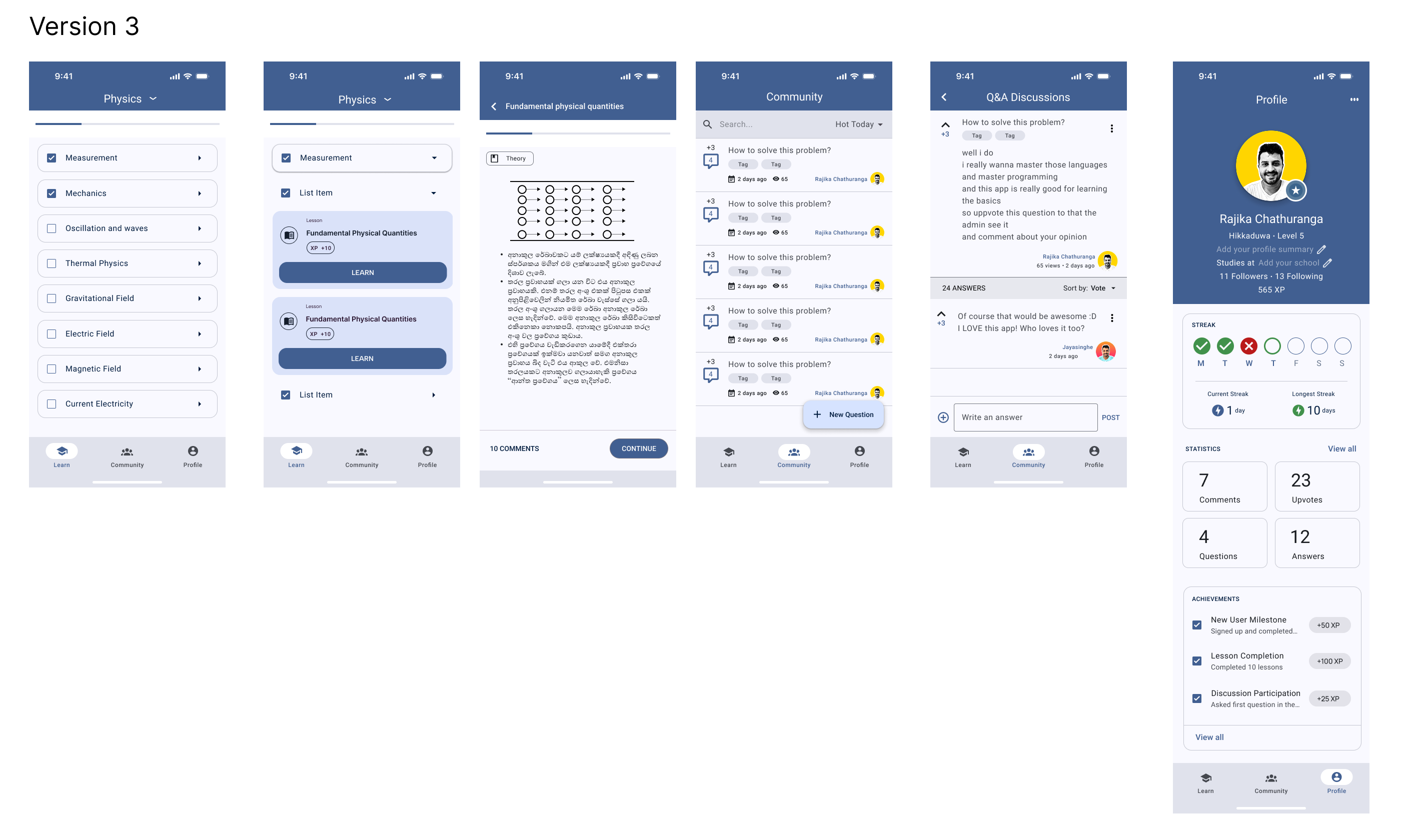
This version was where things really started to take shape. I realized that Studynote needed more than just lessons—it needed a community. I introduced:
- Q&A Discussions for students to help each other.
- A proper leaderboard and XP tracking system.
- Improved readability and consistency across screens.
At this stage, it started feeling more like a real product rather than just a concept.
Version 4: The Final Evolution (For Now)
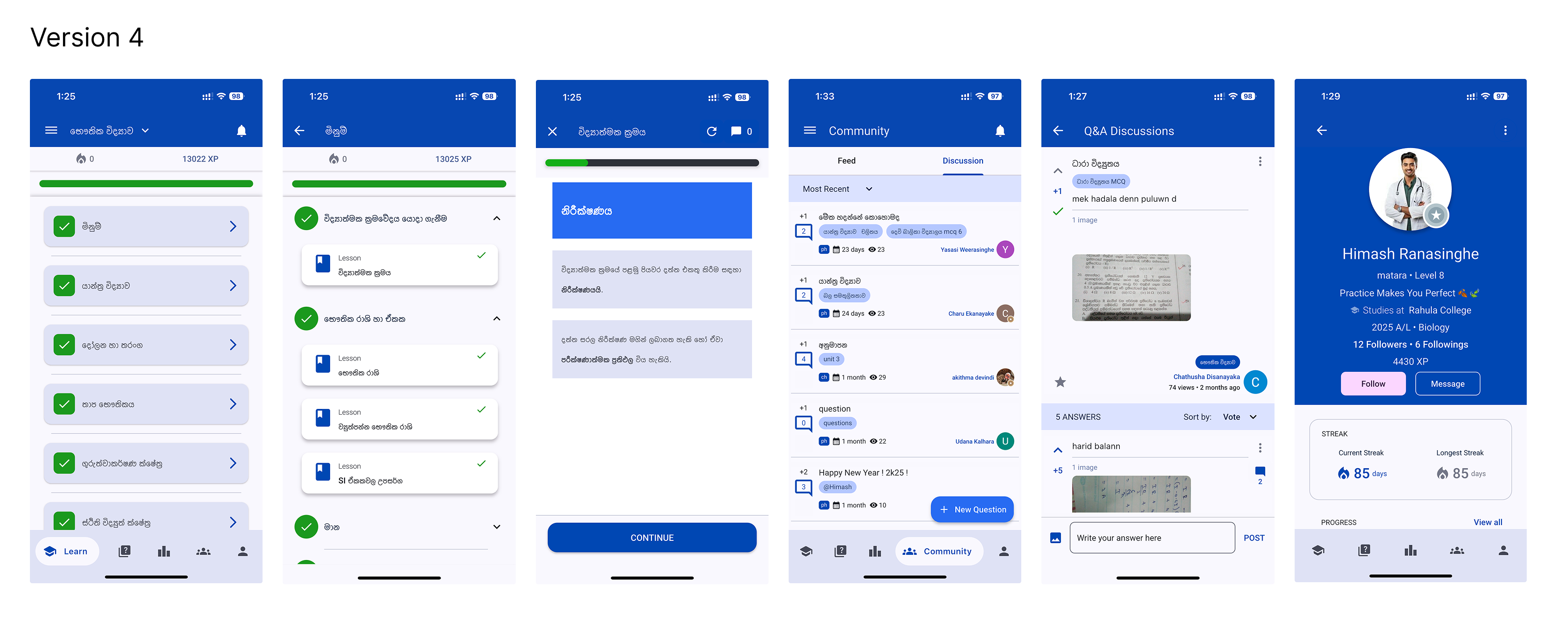
This is where Studynote stands today. I refined the color scheme, improved navigation, and made the UI more interactive and engaging.
Key Upgrades
- A modern look with refined icons and layouts.
- Enhanced profile pages for students.
- Better UX flow to ensure seamless learning.
This version feels polished, user-friendly, and complete—but of course, there’s always room for improvement!
What’s Next?
Now that the UI has reached a solid point, the next focus is development. I’ll be sharing how I built Studynote, the tech stack I used, and the challenges I faced in my next article.
If you’ve been through a similar journey building an app, I’d love to hear your thoughts. Feel free to drop a comment or connect with me. 🚀